A Dashboard That Admits What It Doesn't Know
The hard part wasn't the integrations. It was deciding what a tile shows when the data doesn't arrive.
The short version: I built a weekly SEO and AI-visibility tracker that pulls live from Google Search Console, GA4 and Ahrefs. The interesting decision in it is not any of the integrations. It is that when a data source fails, the tracker shows a visible hole rather than last week's number.
Why it existed
We had three separate problems, and they were the same problem.
A month-long drop in search visibility had gone unnoticed because nothing in our reporting was watching the right number. AI visibility was being tracked by hand in spreadsheets that went stale. And our lead and enrolment numbers lived somewhere else entirely, so nobody could see whether search work was producing anything.
One weekly view, pulled automatically, that put all three side by side.
What I believed going in
The hard part would be the integrations — three APIs, three auth models, three different ideas of what a "week" is.
That turned out to be the easy part. The hard part was much smaller and much more interesting: what should a tile show when the fetch fails?
What actually happened
Every automatic dashboard eventually fails to fetch something. An API key expires. A rate limit hits. A service has an outage on exactly the morning your cron job runs.
Most dashboards handle this by keeping the last known value. It looks tidy. The chart stays smooth. Nobody sees an error.
That is the problem.
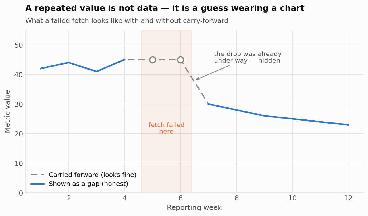
The grey dashed line is a carried-forward value. It looks like a plateau. It is actually two weeks of nothing, sitting on top of a decline that had already started.
By the time the real data returns, the drop appears as a sudden cliff. You investigate the wrong week. You look for a cause that happened at the wrong time.
A repeated value is not data. It is a guess wearing a chart.
And it is worse than a blank, because a blank tells you something is missing. A repeated value tells you everything is fine.
How it works
Every metric, every week, resolves into exactly one of three states.
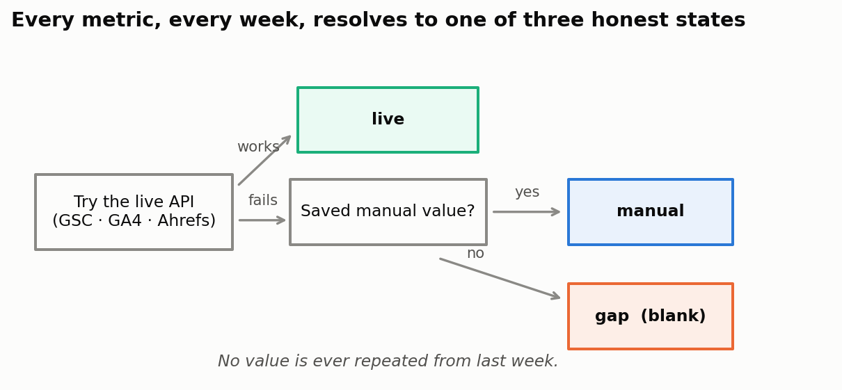
| State | What it means | How it appears |
|---|---|---|
live | Fetched from the API this run | Normal value |
manual | The fetch failed, a saved fallback took over | Value, marked as manual |
gap | The fetch failed and no fallback existed | Blank. A visible hole in the chart. |
Three rules make this hold:
No carry-forward, ever. There is no code path where last week's number becomes this week's number. The option does not exist, so nobody can turn it on during a busy week.
Every value carries where it came from. Provenance is stored next to the number, not in a log. If a tile is showing a manual fallback, you can see that on the tile.
Every run is logged per source. A separate table records which of the three APIs succeeded on each refresh. If Ahrefs has been failing quietly for three weeks, that is visible as a fact rather than something you notice by accident.
There is a fourth category the system never pretends about. Leads and enrolments come from our CRM by hand — there is no API pulling them. Those are marked permanently manual, so they are never dressed up as live data.
The build
Next.js, Supabase and Vercel. Weekly cadence, Wednesday to Tuesday, refreshing automatically every Thursday morning. Around 28 metrics across three groups: search performance, AI visibility, and site health.
It is not a complicated stack. That is intentional — I am a one-person SEO team, and anything I cannot maintain alone is not a tool, it is a liability with a login page.
The principle
Surface uncertainty instead of smoothing it. A missing value must look missing.
This runs against the instinct of anyone building a dashboard, because a dashboard with holes in it looks broken and a dashboard with a smooth line looks finished. The smooth one is lying.
Things this applies to well beyond dashboards:
| Where it shows up | The comfortable version | The honest version |
|---|---|---|
| A dashboard tile | Show last week's number | Show a gap |
| A forecast | A single confident figure | A range, plus what would break it |
| A data table | Fill every cell | Write "not disclosed" where it isn't |
| A report to your manager | Round off the uncertainty | Name the confidence level per claim |
The test for your own reporting: pick any number on your dashboard right now. Can you tell, from looking at it, whether it arrived today or three weeks ago?
If you cannot, then you do not know which of your numbers are real.
What I'd flag
This is a design case study, not a results one. The tracker is recent, and I have no adoption or decision-quality data to show yet — claiming otherwise would be exactly the kind of smoothing the tool was built to prevent.
The three-state model also has an honest cost: the dashboard sometimes looks worse than a competitor's would. Holes are visible. Some weeks it shows you less than you wanted to know. I think that is the right trade, but it is a trade, and anyone copying this should know they are making it.
# Built solo. Next.js, Supabase, Vercel. Live sources: Google Search Console, GA4, Ahrefs API v3 and Brand Radar.
cd ~/blog